
The hubVis package contains a function called
plot_step_ahead_model_output() that can be used to plot
model output that is in the format of forecasts or projects that look
multiple horizons into the future.
This function plots forecasts/scenario quantiles, median and samples projections and optional target data. Faceted plots can be created for multiple scenarios, locations, forecast dates, models, etc. Currently, the function can plot only quantile data, with the possibility to add “median” information from the model projections.
For more information about the Hubverse standard format, please refer to the HubDocs website.
The following vignette describes the principal usage of the
plot_step_ahead_model_output() function.
Plots are available in two output formats:
- “interactive” format: a Plotly output object with interactive legend, hover text, zoom-in and zoom-out options, etc.
- “static” format: a ggplot2 output object. By
default, the output plot is “interactive”, but it can be changed to
“static” by setting the
interactiveparameter to FALSE. See end of the document for examples.
Load and Filter Data
To demonstrate the functionality of the
plot_step_ahead_model_output() function, we will use the
examples data from the hubExamples
package.
Forecast
forecast_outputs: example cdf, mean, median, pmf, quantile, and sample forecast data that represents model outputs from a forecast hub with predictions for three influenza-related targets (wk inc flu hosp, wk flu hops rate category, and wk flu hosp rate) for two reference dates in 2022.forecast_target_ts: contains time series target data associated with the forecast projection data.
Scenario
scenario_outputs: example quantile scenario projection data that represents model outputs and an ensemble (generated withhubEnsemble) from a scenario hub with predictions for one target (inc hosp) in one location ("US"), one round (“2021-03-07”) and four scenarios.scenario_target_ts: contains time series target data associated with the scenario projection data.
Load data
# Data are also available in the HubExamples package
# library(hubExamples)

# Scenario examples
head(scenario_outputs)
#> # A tibble: 6 × 9
#>   model_id        origin_date scenario_id  location target   horizon output_type
#>   <chr>           <date>      <chr>        <chr>    <chr>      <int> <chr>
#> 1 HUBuni-simexamp 2021-03-07  A-2021-03-05 US       inc case       1 quantile
#> 2 HUBuni-simexamp 2021-03-07  A-2021-03-05 US       inc case       1 quantile
#> 3 HUBuni-simexamp 2021-03-07  A-2021-03-05 US       inc case       1 quantile
#> 4 HUBuni-simexamp 2021-03-07  A-2021-03-05 US       inc case       1 quantile
#> 5 HUBuni-simexamp 2021-03-07  A-2021-03-05 US       inc case       1 quantile
#> 6 HUBuni-simexamp 2021-03-07  A-2021-03-05 US       inc case       1 quantile
#> # ℹ 2 more variables: output_type_id <dbl>, value <dbl>
head(scenario_target_ts)
#> # A tibble: 6 × 4
#>   location date       observation target
#>   <chr>    <chr>            <int> <chr>
#> 1 US       2020-10-03      300678 inc case
#> 2 US       2020-10-10      334493 inc case
#> 3 US       2020-10-17      388282 inc case
#> 4 US       2020-10-24      484422 inc case
#> 5 US       2020-10-31      571389 inc case
#> 6 US       2020-11-07      776479 inc case

# Forecast examples
head(forecast_outputs)
#> # A tibble: 6 × 9
#>   model_id    reference_date target horizon location target_end_date output_type
#>   <chr>       <date>         <chr>    <int> <chr>    <date>          <chr>
#> 1 Flusight-b… 2022-11-19     wk in…       0 25       2022-11-19      quantile
#> 2 Flusight-b… 2022-11-19     wk in…       0 25       2022-11-19      quantile
#> 3 Flusight-b… 2022-11-19     wk in…       0 25       2022-11-19      quantile
#> 4 Flusight-b… 2022-11-19     wk in…       0 25       2022-11-19      quantile
#> 5 Flusight-b… 2022-11-19     wk in…       0 25       2022-11-19      quantile
#> 6 Flusight-b… 2022-11-19     wk in…       0 25       2022-11-19      quantile
#> # ℹ 2 more variables: output_type_id <chr>, value <dbl>
head(forecast_target_ts)
#> # A tibble: 6 × 4
#>   target_end_date target          location observation
#>   <date>          <chr>           <chr>          <dbl>
#> 1 2020-01-11      wk inc flu hosp 01                 0
#> 2 2020-01-11      wk inc flu hosp 15                 0
#> 3 2020-01-11      wk inc flu hosp 18                 0
#> 4 2020-01-11      wk inc flu hosp 27                 0
#> 5 2020-01-11      wk inc flu hosp 30                 0
#> 6 2020-01-11      wk inc flu hosp 37                 0
Data Preparation
The forecast and scenario output should be a
model_out_tbl. In addition to the standard requirements for
this class, the plot_step_ahead_model_output() function in
hubVis has other requirement.
- a Date column used for the x-axis of a “step ahead” plot. By
default, the function expect a
"target_date"column, although this could be over-ridden by specifying a different column using thex_col_nameargument. -
quantile,sample, andmedianare the only accepted output type
# Add a `target_date` column in the scenario example
projection_data <- dplyr::mutate(scenario_outputs,
                                 target_date = as.Date(origin_date) +
                                   (horizon * 7) - 1)
head(projection_data)
#> # A tibble: 6 × 10
#>   model_id        origin_date scenario_id  location target   horizon output_type
#>   <chr>           <date>      <chr>        <chr>    <chr>      <int> <chr>
#> 1 HUBuni-simexamp 2021-03-07  A-2021-03-05 US       inc case       1 quantile
#> 2 HUBuni-simexamp 2021-03-07  A-2021-03-05 US       inc case       1 quantile
#> 3 HUBuni-simexamp 2021-03-07  A-2021-03-05 US       inc case       1 quantile
#> 4 HUBuni-simexamp 2021-03-07  A-2021-03-05 US       inc case       1 quantile
#> 5 HUBuni-simexamp 2021-03-07  A-2021-03-05 US       inc case       1 quantile
#> 6 HUBuni-simexamp 2021-03-07  A-2021-03-05 US       inc case       1 quantile
#> # ℹ 3 more variables: output_type_id <dbl>, value <dbl>, target_date <date>
Plot
The plotting function requires only 2 parameters:
model_out_tbl: amodel_out_tblobject containing all the Hubverse standard columns, including a date columnand“model_id”` columns.target_data: adata.frameobject containing the target data, including the columns: a date column and"observation".
We strongly advice to filter both inputted data frame to select only the rows of interest in the plot.
The function can plot three model output type:
"quantile", "sample", and
"median". Any other additional output type will be filtered
out and a warning will be issued. The two parameters:
intervals and use_median_as_point can be used
to decide what output type to plot:
-
intervals:- a vector of
numericvalues indicating which central prediction interval levels to plot using"quantile"output type. If no quantile is available in themodel_out_tblobject and if"sample"are present, the samples will be used to calculate the required quantiles. Value possibles:0.5,0.8,0.9,0.95 -
NULLcan be used to indicate to plot the"sample"output type in a spaghetti plot. - By default, the
intervalsparameter is set toc(.5, .8, .95)and expect"quantile"or"sample"output type in themodel_out_tblobject
- a vector of
-
use_median_as_point:- Boolean to indicate to plot the median. If the
model_out_tblcontains"median"output type, it will be used preferably. If not available, the"quantile", value0,5will be used. And if both are unavaiable, the"sample"output type can be used to calculate the median.
- Boolean to indicate to plot the median. If the
“Simple” plot
Forecast
To plot the forecast projections for one reference dates (2022-11-19) for Massachusetts (25).
# Pre-filtering
forecast_quantile <- dplyr::filter(forecast_outputs,
                                   output_type == "quantile",
                                   reference_date == "2022-11-19",
                                   location == 25) |>
  dplyr::mutate(output_type_id = as.numeric(output_type_id))

# Limit date for layout reason
forecast_target_ma <- dplyr::filter(forecast_target_ts, location == 25,
                                    target == "wk inc flu hosp",
                                    target_end_date >= "2022-11-01",
                                    target_end_date <= "2023-01-01")
As the forecast projections used the column
target_end_date for date column and contains the quantiles:
"0.05", "0.1", "0.25",
"0.5", "0.75", "0.9",
"0.95", the parameters in the
plot_step_ahead_model_output() needs to be ajusted:
plot_step_ahead_model_output(forecast_quantile, forecast_target_ma,
                             intervals = c(0.9, 0.5),
                             x_col_name = "target_end_date",
                             x_target_col_name = "target_end_date")
The median can be added to the plot:
plot_step_ahead_model_output(forecast_quantile, forecast_target_ma,
                             intervals = c(0.9, 0.5),
                             use_median_as_point = TRUE,
                             x_col_name = "target_end_date",
                             x_target_col_name = "target_end_date")
Samples Output Type
By setting the intervals parameter to NULL,
the plot_step_ahead_model_output() function will plot the
"sample" output type in a spaghetti plot
forecast_sample <- dplyr::filter(forecast_outputs, output_type == "sample",
                                 reference_date == "2022-11-19",
                                 location == 25)
plot_step_ahead_model_output(forecast_sample, forecast_target_ma,
                             intervals = NULL,
                             x_col_name = "target_end_date",
                             x_target_col_name = "target_end_date")
Same as "quantile" output type, a median can be added to
the plot by using the use_median_as_point = TRUE parameter.
The median is plotted either by using the "median" output
type in the inputted data frame or the "quantile" 0.5 or
the function calculate it by using the "sample", depending
on the content of the inputted data frame
forecast_sample <- dplyr::filter(forecast_outputs, output_type %in%
                                   c("sample", "median"),
                                 reference_date == "2022-11-19",
                                 location == 25)
plot_step_ahead_model_output(forecast_sample, forecast_target_ma,
                             intervals = NULL, use_median_as_point = TRUE,
                             x_col_name = "target_end_date",
                             x_target_col_name = "target_end_date")
The rest of the vignette is using "quantile" output type
to show the multiple functionality of
plot_step_ahead_model_output(). The same functionality is
also available for spaghetti plots using "sample" output
type.
Scenario
To plot the model projections for the US, Scenario A:
# Pre-filtering
projection_data_a_us <- dplyr::filter(projection_data,
                                      scenario_id == "A-2021-03-05",
                                      location == "US")

# Limit date for layout reason
target_data_us <-
  dplyr::filter(scenario_target_ts, location == "US",
                date < min(projection_data$target_date) + 21,
                date > "2020-10-01")
By default, the function will plot the quantiles intervals:
projection_plot <- dplyr::filter(projection_data_a_us, output_type == "quantile")
plot_step_ahead_model_output(projection_plot, target_data_us)
By default, the 50%, 80% and 95% intervals are plotted, with a
specific color palette per model_id.
In general, it is hard to see multiple intervals when multiple models are plotted, so specifying only one interval can be useful:
plot_step_ahead_model_output(projection_plot, target_data_us,
                             intervals = 0.8)
It is also possible to add a median line on the plot with the
use_median_as_point parameter:
plot_step_ahead_model_output(projection_plot, target_data_us,
                             intervals = 0.8,
                             use_median_as_point = TRUE)
By default plots are interactive, but that can be easily switched to static:
plot_step_ahead_model_output(projection_plot, target_data_us,
                             intervals = 0.8,
                             use_median_as_point = TRUE,
                             interactive = FALSE)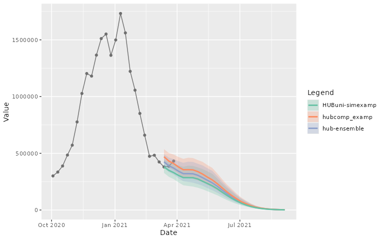
Facet plot
Scenario
A “facet” (or subplot) plot can also be created for each scenario
# Pre-filtering
projection_data_us <- dplyr::filter(projection_data,
                                    location == "US")
plot_step_ahead_model_output(projection_data_us, target_data_us,
                             facet = "scenario_id")
The layout of the “facets” can be adjusted, with the different
facet_ parameters.
plot_step_ahead_model_output(projection_data_us, target_data_us,
                             use_median_as_point = TRUE,
                             facet = "scenario_id", facet_scales = "free_x",
                             facet_nrow = 2, facet_title = "bottom left")
Or with the additional facet_ncol parameter for the
statics plot
plot_step_ahead_model_output(projection_data_us, target_data_us,
                             use_median_as_point = TRUE, interactive = FALSE,
                             facet = "scenario_id", facet_scales = "free_x",
                             facet_ncol = 4, facet_title = "bottom left")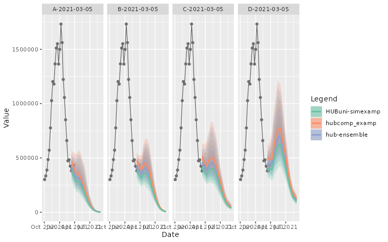
A “facet” (or subplot) plot can also be created for each model. In
this case, the legend will be adapted to return the
model_id value.
plot_step_ahead_model_output(projection_data_a_us, target_data_us,
                             facet = "model_id")
The legend can be removed with the parameter
show_legend = FALSE.
plot_step_ahead_model_output(projection_data_a_us, target_data_us,
                             facet = "model_id", show_legend = FALSE)
Forecast
A “facet” (or subplot) plot can also be created for each location
forecast_quantile_1 <- dplyr::filter(forecast_outputs,
                                     reference_date == "2022-11-19",
                                     output_type == "quantile") |>
  dplyr::mutate(output_type_id = as.numeric(output_type_id))
forecast_target <- dplyr::filter(forecast_target_ts,
                                 target_end_date >= "2022-11-01",
                                 target_end_date <= "2023-01-01",
                                 target == "wk inc flu hosp",
                                 location %in% forecast_quantile_1$location)
plot_step_ahead_model_output(forecast_quantile_1, forecast_target,
                             intervals = c(0.9, 0.5),
                             use_median_as_point = TRUE,
                             x_col_name = "target_end_date",
                             x_target_col_name = "target_end_date",
                             facet = "location")
Intervals
By default, the 50%, 80% and 95% intervals are plotted. However, it is possible to also plot the 90% intervals or a subset of these intervals. When plotting 6 or more models, the plot will be reduced to show the widest intervals provided (95% by default).
To illustrate this we will use the projections for only one model in the scenario example
# Pre-filtering
projection_data_mod <- dplyr::filter(projection_data,
                                     location == "US",
                                     model_id == "hub-ensemble")
plot_step_ahead_model_output(projection_data_mod, target_data_us,
                             use_median_as_point = TRUE, facet = "scenario_id",
                             facet_nrow = 2, intervals = c(0.5, 0.8, 0.9, 0.95))
The opacity of the intervals can be adjusted:
plot_step_ahead_model_output(projection_data_mod, target_data_us,
                             use_median_as_point = TRUE, facet = "scenario_id",
                             facet_nrow = 2, intervals = c(0.5, 0.8, 0.9, 0.95),
                             fill_transparency = 0.15)
Plots without intervals are also possible (if no
"sample" is available). A warning will be printed for the
missing samples:
plot_step_ahead_model_output(projection_data_mod, target_data_us,
                             use_median_as_point = TRUE, facet = "scenario_id",
                             facet_nrow = 2, intervals = NULL)
#> Warning: ! `plot_set_ahead_model_output()` was expecting "sample" output_type due to
#>   `intervals` set to `NULL`. `model_out_tbl` is missing the output_type
#>   "sample". No intervals or samples will be plotted.
Other parameters
Several other parameters are available to update the plot output. Here is some examples of some parameters.
“Ensemble” layout
It is possible to assign a specific color and behavior to a specific
model_id. Typically, this is done to highlight an ensemble,
so the name for these arguments are ens_name and
end_color. The model specified by ens_name
will be the top layer of the resulting plot.
plot_step_ahead_model_output(projection_data_us, target_data_us,
                             use_median_as_point = TRUE,
                             facet = "scenario_id", facet_nrow = 2,
                             ens_name = "hub-ensemble", ens_color = "black",
                             intervals = 0.8)
“Group” layout
An optional parameter group in the
plot_step_ahead_model_output() function to allow to group
or partition the input data in the plot according to a specific column.
Please refer to ggplot2::aes_group_order for more
information.
To illustrate this we will use the forecast example for both reference date:
forecast_out <- dplyr::filter(forecast_outputs, output_type %in%
                                c("quantile", "median")) |>
  dplyr::mutate(output_type_id = as.numeric(output_type_id))
plot_step_ahead_model_output(forecast_out, forecast_target,
                             intervals = c(0.9, 0.5),
                             use_median_as_point = TRUE,
                             x_col_name = "target_end_date",
                             x_target_col_name = "target_end_date",
                             facet = "location",
                             group = "reference_date")
Log scale
An optional Boolean parameter log_scale is available in
the plot_step_ahead_model_output() function to plot the
y-values of all inputs (model output and target data) on a log
scale.
plot_step_ahead_model_output(projection_data_us, target_data_us,
                             facet = "scenario_id", facet_nrow = 2,
                             use_median_as_point = TRUE, log_scale = TRUE)
Layout update
Multiple layout update are possible:
- Not showing the target data in the plot:
plot_step_ahead_model_output(projection_data_a_us, target_data_us,
plot_target = FALSE)- Change the top layer to the target data:
plot_step_ahead_model_output(projection_data_a_us, target_data_us,
top_layer = "target")- Add a title to the plot:
plot_step_ahead_model_output(projection_data_a_us, target_data_us,
title = "Incident Cases in the US")- Change palette color and behavior:
- The default palette can be changed. All the available palette names are available here:
RColorBrewer::display.brewer.all()
plot_step_ahead_model_output(projection_data_a_us, target_data_us,
pal_color = "Dark2")- By default, separate colors will be used for each model.
The fill_by parameter can be change to another valid
column names to change the legend and colors attributes to this new
column.
plot_step_ahead_model_output(projection_data_us, target_data_us,
                             facet = "model_id", fill_by = "scenario_id")
It is possible to use only blues for all models, by setting the
pal_color parameter to NULL. This might be
especially useful when used for many models in conjunction with
highlighting the ensemble forecast using the ens_name and
ens_color argument.
plot_step_ahead_model_output(projection_data_a_us, target_data_us,
                             intervals = 0.8,
                             ens_name = "hub-ensemble", ens_color = "black",
                             pal_color = NULL, use_median_as_point = TRUE)
The default blue color can be changed with the one_color
parameter
plot_step_ahead_model_output(projection_data_a_us, target_data_us,
                             intervals = 0.8, one_color = "orange",
                             ens_name = "hub-ensemble", ens_color = "black",
pal_color = NULL, use_median_as_point = TRUE)- Interactive/Static plot:
plot_step_ahead_model_output(projection_data_a_us, target_data_us,
                             interactive = FALSE)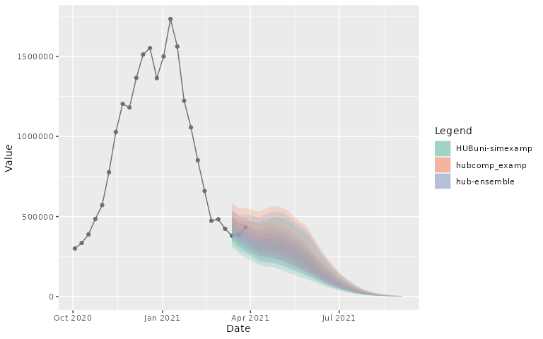
- Column Names:
The input data frames can have different column names for the date
information. In this case, the two x_col_name and
x_target_col_name parameters can be used to indicate the
variables that should be mapped to the x-axis.
names(target_data_us)[names(target_data_us) == "date"] <- "time"
names(projection_data_a_us)[names(projection_data_a_us) == "target_date"] <-
  "date"
plot_step_ahead_model_output(projection_data_a_us, target_data_us,
                             x_col_name = "date", x_target_col_name = "time")
For other parameters, please consult the documentation associated
with the function: ?plot_step_ahead_model_output